A shared Figma library as a design toolkit

Author
Feline Hu
Published
15 September 2022
Reading time
4 minutes
The Figma design tool is used in many ways. It is the design tool to design screens, build prototypes and test. Figma is also used to design reusable components that are used by the entire team. In Figma, they also call this shared libraries.
A shared library consisting of UI elements for digital products can be part of a design system. This allows you to see a shared library as a stepping stone to a design system. The library aims to design more efficiently, consistently and better.
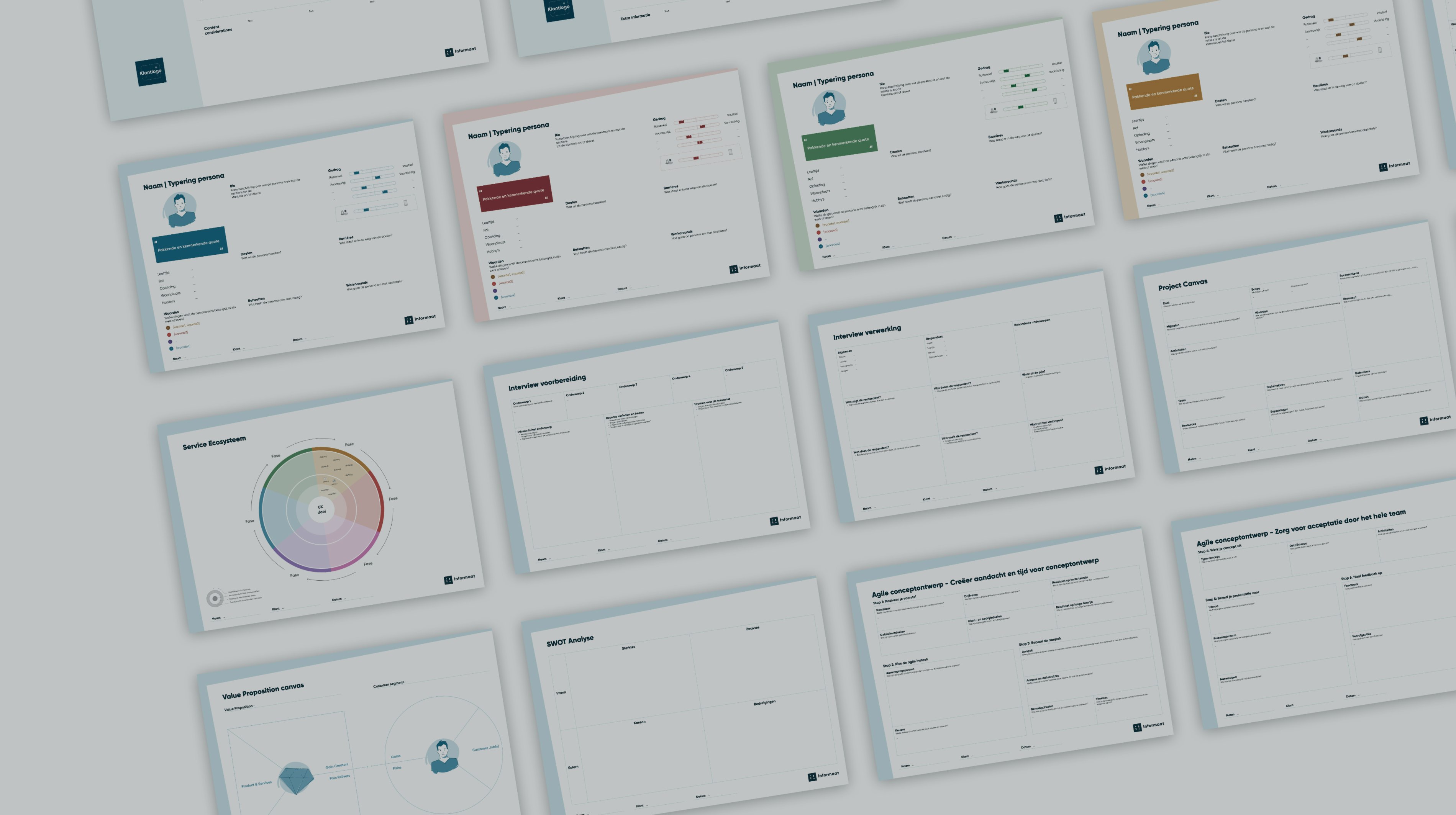
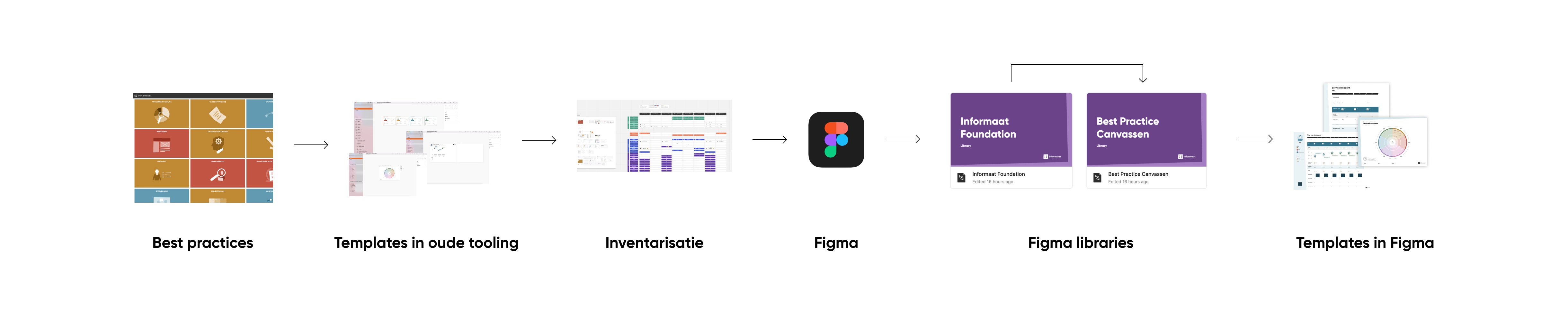
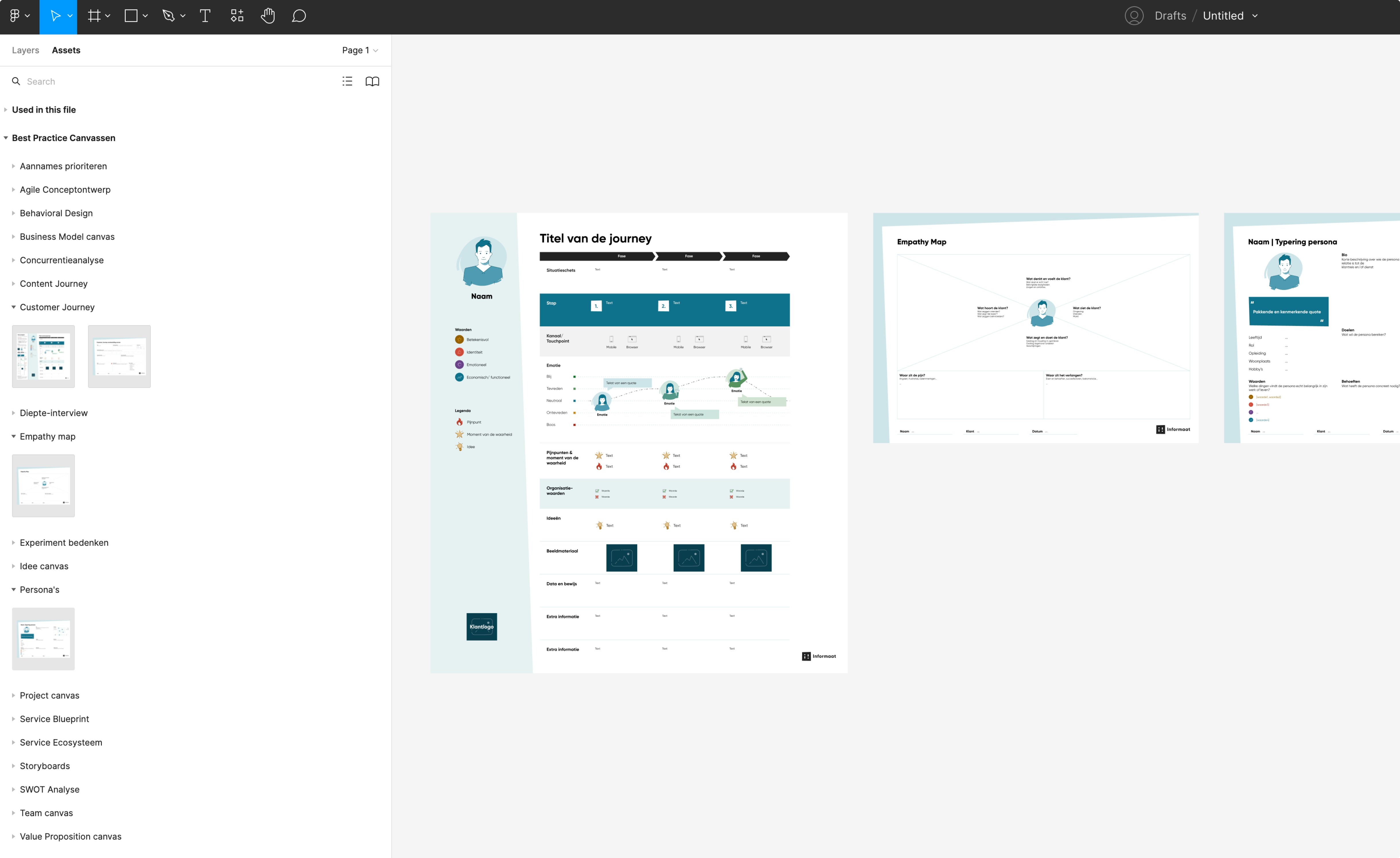
We used Figma to set up a shared component library as a design toolkit for our colleagues at Informaat. This toolkit consists of a collection of templates that supports our best practices for the digital design process. What kind of templates are we talking about? In our work there are a lot of methods that can help us in the design process. Applying a method correctly and documenting it well is always a challenge. To make this easier, we have a number of handy templates that can help with this. Examples of methods with templates are a Competitive Analysis, Persona, Customer Journey and Storyboard.
How nice would it be if we could set up our design toolkit in such a way that fellow designers can always easily use the most up-to-date version of a best practice template? We have used Figma for this and in this blog we show how we have approached this.
Structure of templates
In order to make our design toolkit as simple as possible for fellow designers, we have applied the Atomic design principles. As a result, the templates can also be used for different purposes.
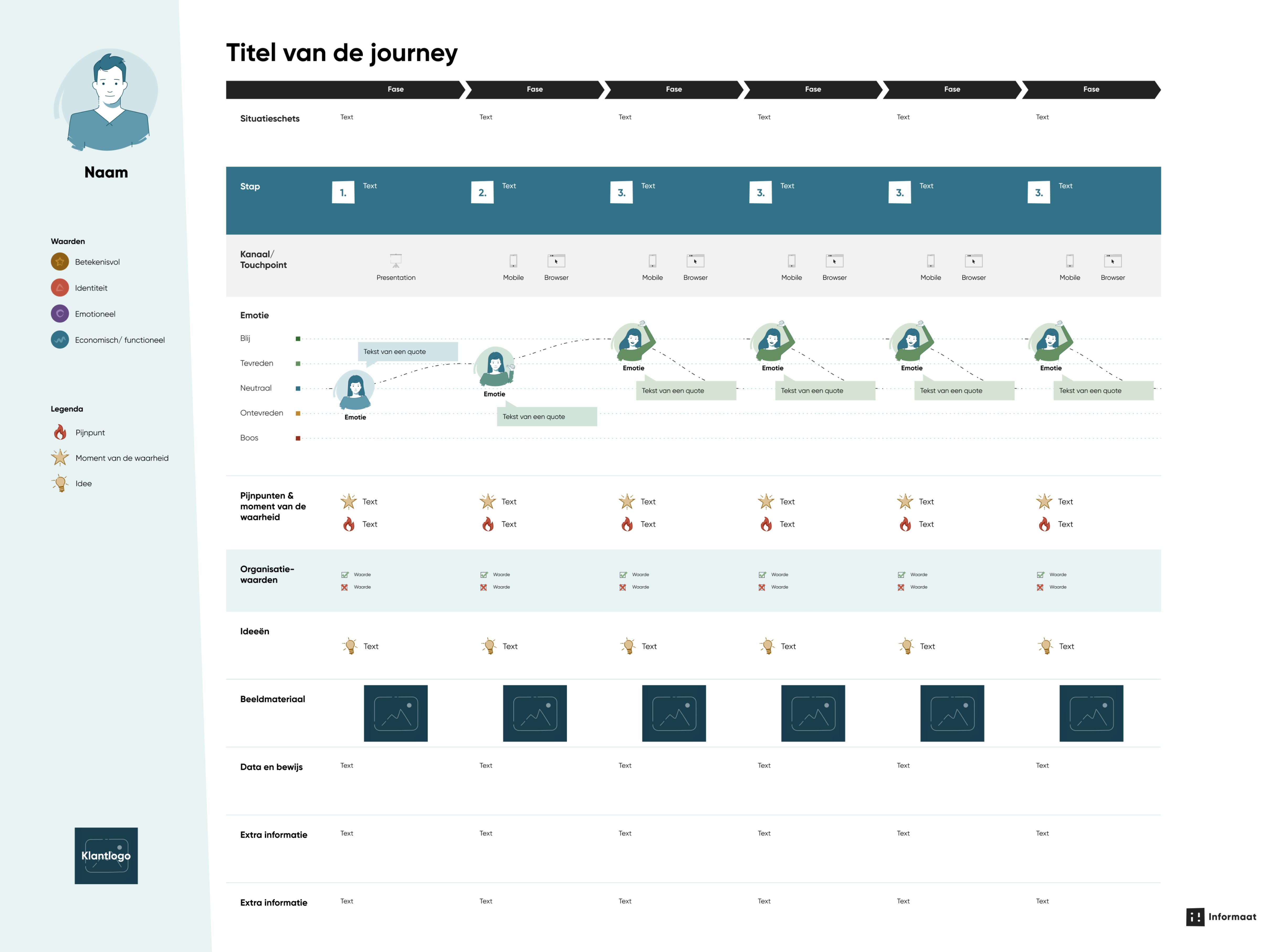
According to the principles of Atomic design, templates consist of smaller components - fundamental building blocks with which a template is built. We are talking about atoms, molecules, organisms and full pages. If we take the Customer Journey as an example, the atoms are the timeline, step, touchpoint and emotion curve. These together form a molecule: a step in the timeline of the Customer Journey. By bringing these molecules together, an organism is created. These are groups of molecules that together form a section in the template.
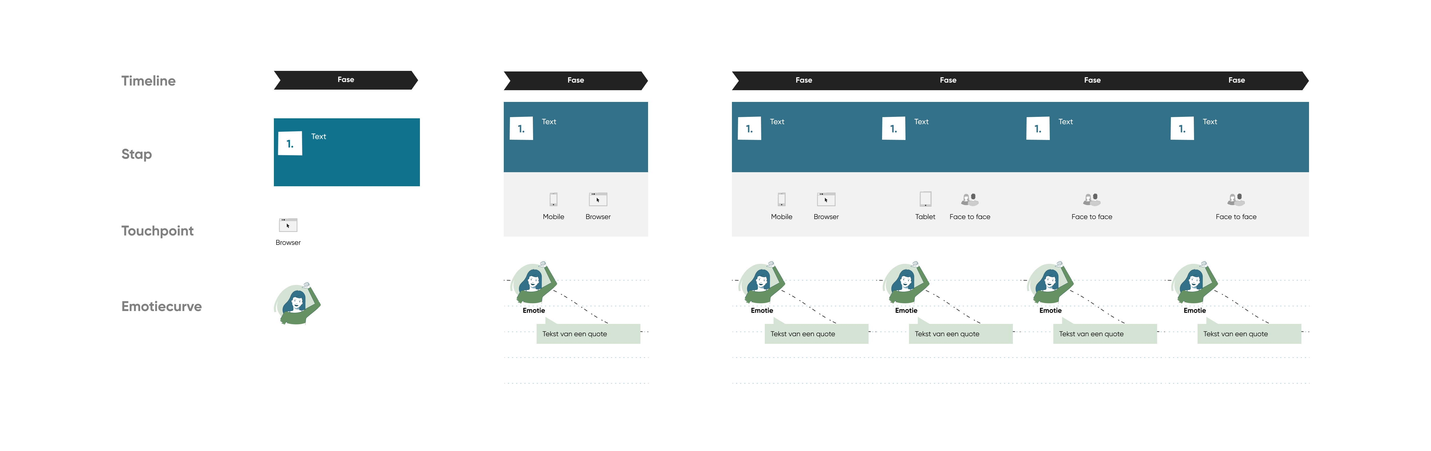
By bringing those sections together, you get a complete template of the Customer Journey.
Advantages of Figma libraries
Figma makes it possible to turn each file into a shared library, which is then very easy to adjust. Figma makes these adjustments directly to everyone with whom the library has been shared, so that the most up-to-date version can always be used easily.
TIP : Keep in mind that Figma libraries work at team level and therefore a paide license is required.
In order to set up the design toolkit as easily as possible in Figma, we have created two shared libraries. A library with only the complete templates and a library with all the supporting components used in the templates, the 'foundation'.
For our fellow designers, we only want to have the complete templates in view, because that is what they need for their work. To achieve this, we have opted for two shared libraries. The foundation offers a look behind the scenes and is for us (the administrators) to maintain. In addition, two libraries make it possible to scale up in the future.
Tips for a solid foundation
Where do you start? When setting up a shared component library, you first need to lay the foundation. The base consists of core elements such as colors, typography and icons. Here are some tips:
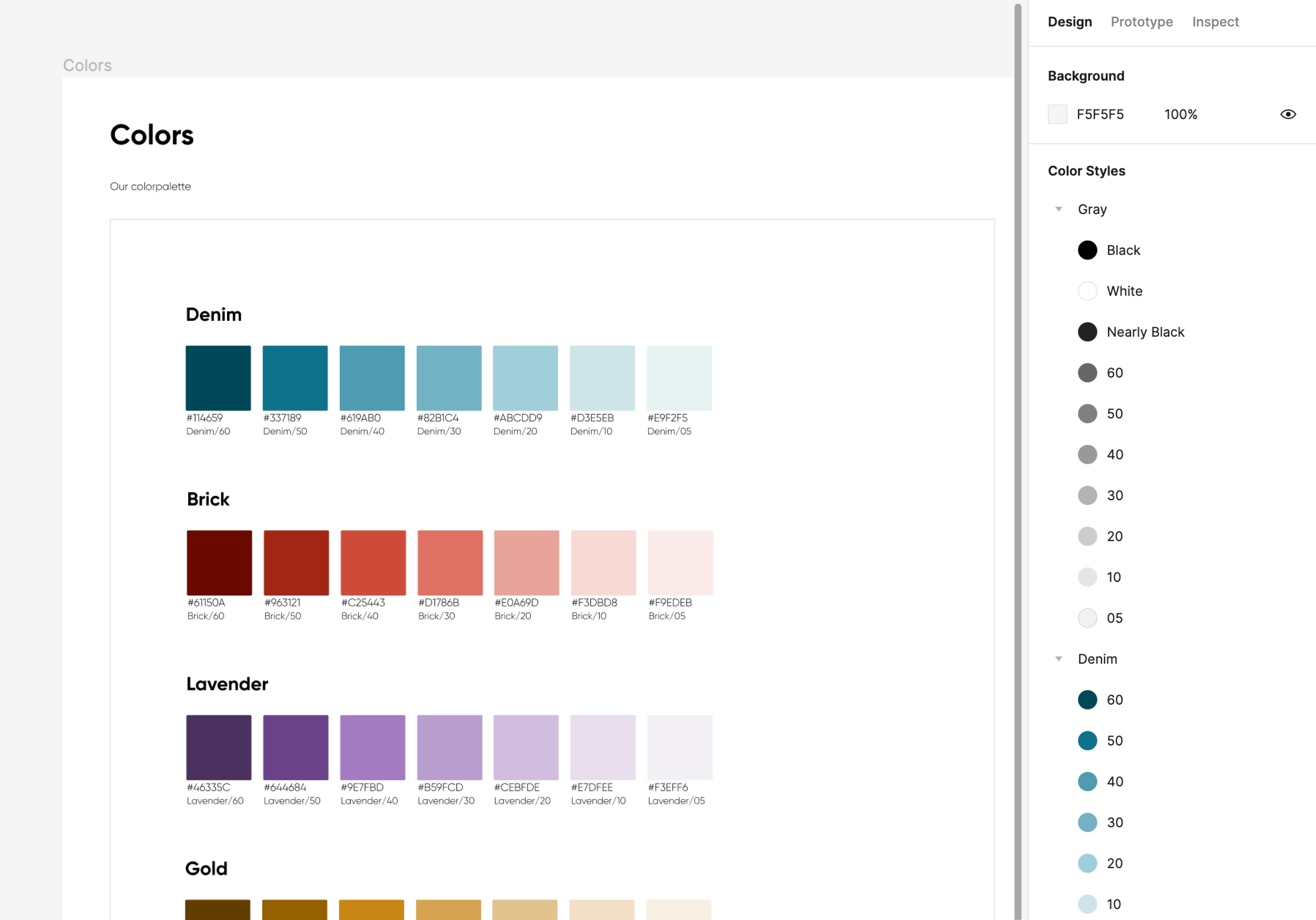
- Start with a color palette and keep the basic colors to a minimum i.e. primary, secondary and tertiary.
- Keep the naming conventions simple and use slashes. For example Gray/Black, Gray/Nearly Black & Gray/60.
- Add the colors to the Styles in the right panel.
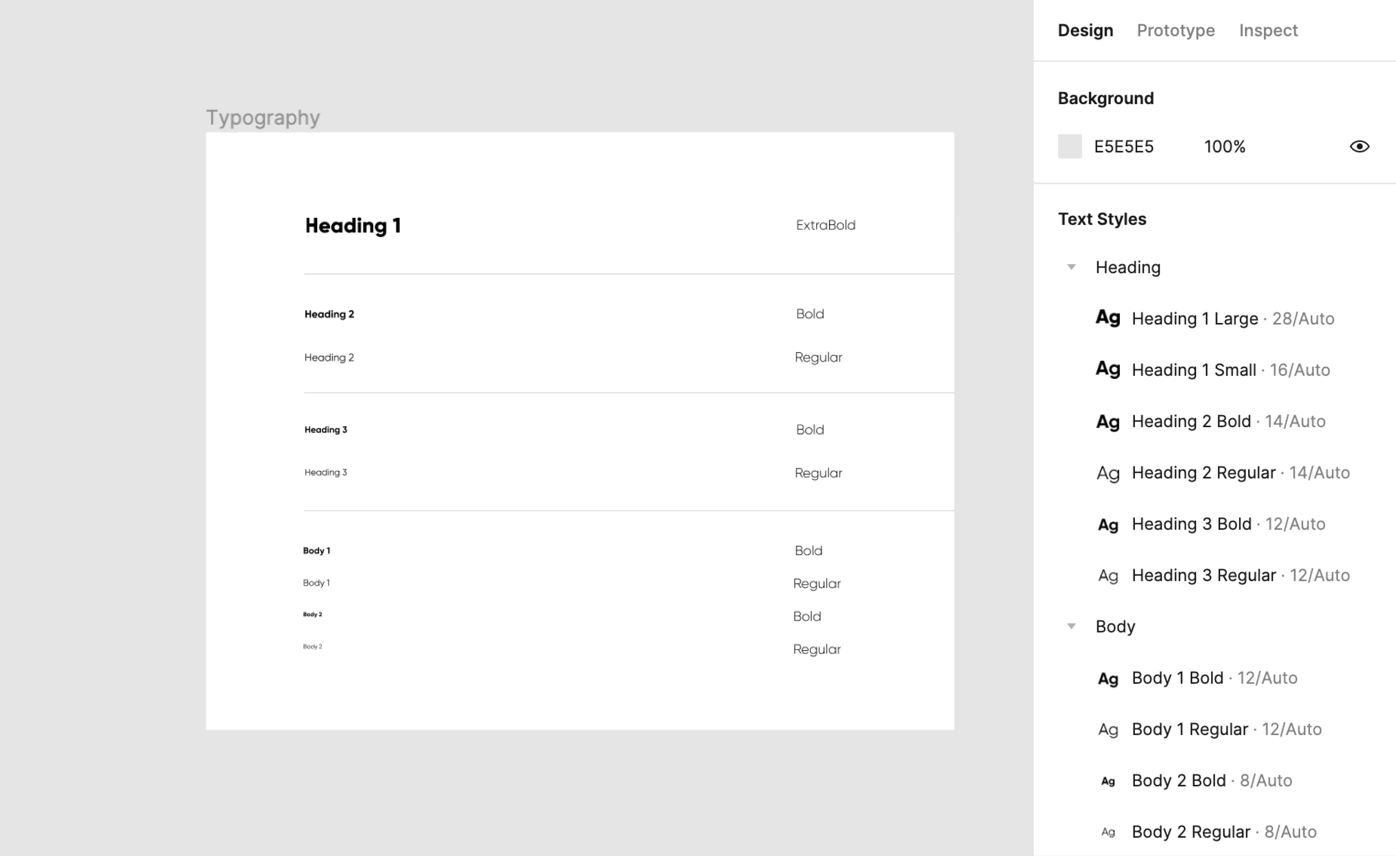
- Start with two font families for typography.
- Then distinguish between Heading and Body.
- Again, keep the naming conventions simple and use slashes. E.g. Heading/Heading 1 Large, Heading/ Heading 1 Small, Heading/ Heading 2 Bold, Heading/ Heading 2 Regular
- Add the typography to the Styles in the right panel.
Once you have set up the basics, you can apply the core elements to the components and thus build up the templates of your library according to the Atomic design principles .
Faster, more consistent and more focus on the content
Figma makes it possible to build according to the Atomic design principles, easily reuse and share over multiple projects and files. By offering the design toolkit as a shared library in Figma, fellow designers can now easily use templates in their own project files from the shared library. The templates are immediately up-to-date and can be adapted to your own wishes and needs. For example, when you want to cast the template in the visual style of the customer. That was done in a few actions.
In addition, fellow designers can focus on the content during use and not on the underlying structure of a Customer Journey, such as the layout and the types of rows. We arrange that for them. We ensure that the design toolkit is up-to-date, accessible and as usable as possible and remains within Figma.
Want to get started with a shared Figma library? We hope our tips help you. We are curious about your experiences!
This article was created in close collaboration with my colleague Hannah Pak.
About the author

Tools