Enterprise UX 2023: the professional is central

Author
Carla Huls
Published
01 December 2023
Reading time
4 minutes
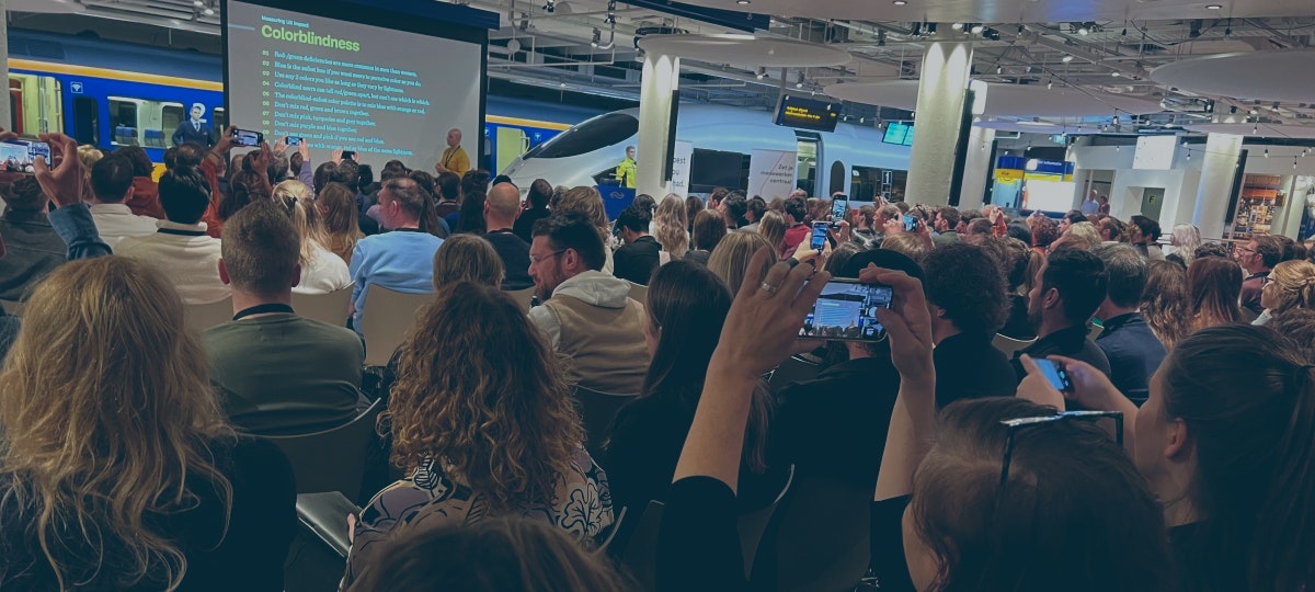
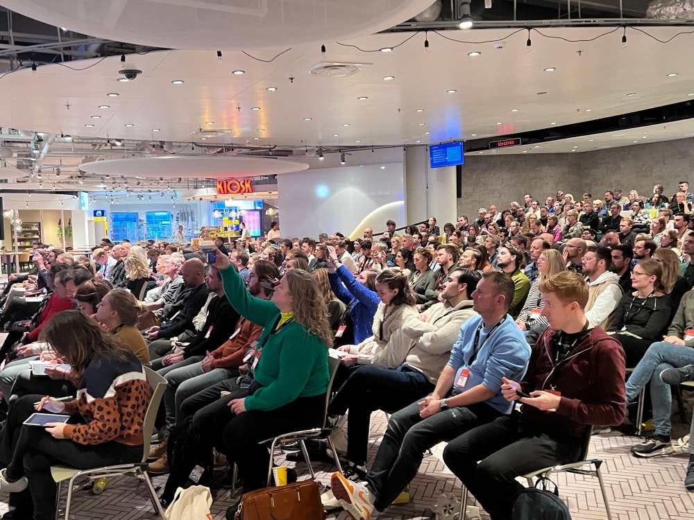
Last Friday we met with more than 300 other UX/UI designers for the first Dutch Enterprise UX conference in Utrecht - a conference about designing software for professionals. And that in a beautiful hall at NS. Yes, there was a real train, a station clock and the live sign with arrival times. A trip report by Joëlle van Schaaik and Carla Huls.
The event was excellently organized by a consortium of 12 volunteers from different organizations and agencies (see enterpriseux.nl). The program included five presentations from the enterprise UX practice, a panel discussion on design systems and an inspiring story by Astrid Poot (goedmaken.org) in which she taught us how we as UX designers can deal with values and ethics. We also visited the police's mobile media lab outside; a bus that the police use to conduct user tests across the country.
During the presentations, but also during the breaks and drinks, we heard a great deal of recognition from everyone of all the examples and issues that were discussed. We also felt a kind of relief ourselves: "So I'm not the only one who encounters this and doesn't immediately know how to solve it!" So nice to recognize this.
Here are our takeaways from the day.
About the enterprise UX designer
- Enterprise UX is so much fun because it is very complex puzzles and as a UX designer you can really mean something to your users.
- Astrid made us realize that as a designer you want to do 'the Good'. That sounds grand, but we shouldn't make it bigger than it needs to be. Small steps are also good. That is why we should not underestimate our role. Always keep asking why!
- The enterprise UX designer is excited to really dive into the user's world.
- According to Astrid, this personal involvement is also very important: no matter how good a study is, really good ideas come from involvement.
About the users
- Professional users don't want whitespace, they want as few clicks or scrolls as possible.
- Tables, on the other hand, they do! And that's fine, but keep in mind, for example, that these also have to be accessible and how you want to show them on a mobile.
- Professional users don't really want anything to change: a good implementation process and a good substantiation of the improvements is crucial for acceptance. At NS, it turned out that sometimes you have to accept that something cannot change (in the foreseeable future). If users have been using 'illogical' colours for years, you don't just change them.
- Employees are people too (!). They represent the values and goals of the organization, so include them in your design as well. For example, the Police strives to make the application feel like a good colleague with matching values, goals and behaviour.
About the organisation
- Enterprises have many so-called 'legacy' systems, which:
- are often unuser-friendly applications;
- are often standard software packages, which means that as a designer you cannot take all the freedom in your designs;
- together, they deliver a large landscape of partially overlapping applications. Only the very experienced user will find his way around this.
- So where do you start as a designer? Before you know it, you'll be adding a new application to the complex landscape. Marieke van Kouwen of NS says: First visualize the landscape and strive for integration, so that your new feature will actually be used.
About methods and process
- User insights are key: it's the only way to design something that's really going to be used the way it's meant to be. At NS and at PostNL (Jos Kauling with Rien Buisman of Informaat) it turned out that only by knowing what is desired from the organization and knowing how users work in practice can you design the flow in such a way that the users will actually carry out the desired process.
- Accessibility and inclusivity are just as important as consumer apps, but even harder to sell. Vitaly Friedman of Smashing Magazine mentioned aspects such as color blindness, age, dyscalculia, and temporary limitations such as the sun shining on your screen. This also happens to employees, so keep that in mind. For example, pay attention not only to the choice of a color, but also to the combination of colors so that they are easily distinguishable for everyone. The only exception: 'blue is safe'. The color blue is the same for everyone.
- In the panel discussion, it turned out that accessibility is also a good argument for the use of a design system: once well designed and well tested, it is much easier and cheaper to apply and maintain.
- The panel agreed that Enterprise UX needs proprietary patterns in the design system. In the case of NS and Nexus, this was due to the use of their own design system, in the case of the Police and the NL design system, in the case of a theme.
- Harald Lamberts of Essense showed that Employee Journeys are about the journey from onboarding to leaving the company. The journeys don't say much about the design of a single application. However, they do show the importance of good software in employee satisfaction, which in turn is important for the quality of the final service to the customer.
- Vitaly designs for employee efficiency and inclusivity. He used KPIs such as: margin of error and time to complete. Very interesting to see how you can make your designs measurable in this way and link them to business goals.
Our conclusion is that the field of Enterprise UX has fortunately received more and more attention in recent years, but is still quite immature. Designers run into very basic issues and are still very much looking for methods and solutions that are more focused on the use of complex task-supporting applications. Enough material for the next EUX conference. And we would love to go there again!
About the author

UX
Enterprise